Have you ever wondered what secrets hide in plain sight on your favorite record sleeves? We dug into the fascinating lore behind rock's greatest album covers to uncover the bizarre truths. Ready to be surprised?
Pink Floyd, Wish You Were Here (1975), The Stuntman Actually Set Himself on Fire and Accidentally Singed His Face Off When the Wind Shifted
The iconic photograph shows 2 businessmen shaking hands in an empty studio lot, with 1 of the men casually engulfed in flames. To achieve this practical effect before the era of digital manipulation, designer Storm Thorgerson hired professional stuntmen Ronnie Rondell and Danny Rogers. Rondell wore a fire-retardant suit beneath his business attire and had a protective hood over his head, which was hidden by the angle of the photograph.
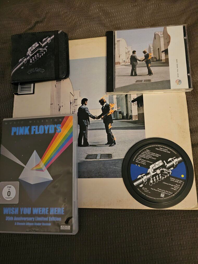
The wind shifted unexpectedly during the shoot, blowing the flames directly into Rondell's face and reportedly singeing his mustache. He immediately dropped to the ground to be extinguished by the crew. The powerful image represents the theme of people hiding their true feelings for fear of getting burned, which was a direct commentary on the band's cynical view of the music industry and their longing for former bandmate Syd Barrett.
The Rolling Stones, Sticky Fingers (1971), The Working Metal Zipper Wreaked Havoc by Accidentally Scratching and Destroying the Vinyl Records Packed Beneath It
The innovative packaging featured a close-up photograph of a man's crotch clad in tight denim jeans, complete with a real, working metal zipper. The concept was conceived by legendary pop artist Andy Warhol, who was paid 15000 dollars for his contribution. When buyers unzipped the cover, they revealed an image of white cotton underwear beneath the denim. The bulky zipper caused a massive logistical nightmare during shipping, as the metal pressed into the vinyl grooves of the records stacked above it, ruining the track 'Sister Morphine.
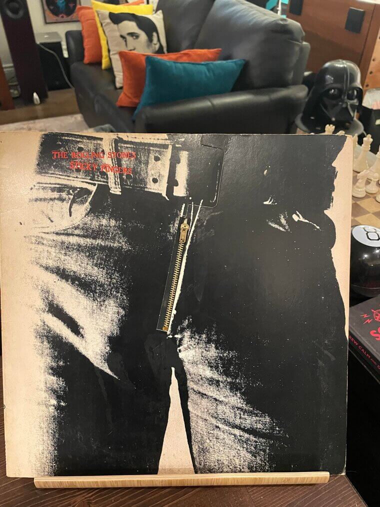
' The label quickly solved the problem by unzipping all the covers before packing them, so the zipper rested safely on the center label. The identity of the male model has never been conclusively proven, with multiple actors and musicians claiming the honor over the past 5 decades.
Black Sabbath, Black Sabbath (1970), The Spooky Cloaked Woman Was Actually Just a Freezing Model Trying to Stay Warm During an Early Morning Shoot
The striking image features a mysterious woman standing outside the Mapledurham Watermill in Oxfordshire, England. For many years, fans debated whether the figure was a real person, an actress, or even a witch who happened to be wandering the grounds during the photoshoot. Photographer Marcus Keef took the shot using a special color infrared film technique, giving the trees and grass their unusual, sickly pinkish hue. The model was eventually revealed to be a woman named Louisa Livingstone.
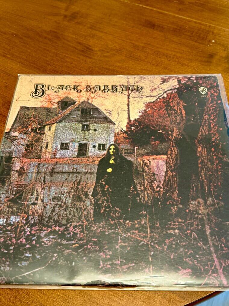
She reportedly brought her own black cloak to the cold morning shoot, though she originally thought they were shooting a standard nature photograph. The unsettling final image perfectly encapsulated the heavy, doom-laden sound the band was pioneering. The inner gatefold contained a poem about a dark entity, further adding to the spooky aura that surrounded the band for the rest of their career.
Ozzy Osbourne, Diary of a Madman (1981), The Singer Secretly Snuck His Young Son Onto the Elaborate Theatrical Set to Hide in the Background Shadows
The theatrical photograph features the singer covered in artificial stage blood, chained in an elaborate dungeon set alongside an eerie, glowing fireplace. If you look closely at the background behind the singer, you can spot a small child hiding in the shadows. The boy is reportedly Osbourne's own son, Louis, who was brought to the studio that day and sneaked into the shot. The set was designed to resemble a classic horror movie poster, fully embracing the controversial public persona the singer had built.
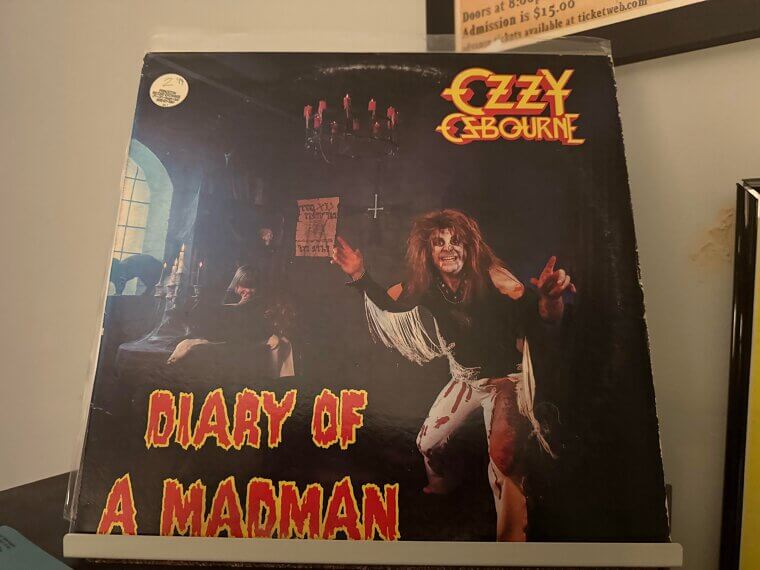
The dead cat seen on the table was allegedly a prop found in a theatrical supply store, dispelling rumors that the singer harmed animals for the shoot. The dark, theatrical visual helped solidify his reputation as the ultimate madman of rock following his highly publicized departure from his former band.
Megadeth, Peace Sells... But Who's Buying? (1986), The Bright Orange and Red Sky Was Deliberately Chosen to Simulate the Apocalyptic Aftermath of a Cold War Blast
The artwork features the band's skeletal mascot, Vic Rattlehead, leaning on a 'For Sale' sign in front of the destroyed remains of the United Nations headquarters in New York. Artist Ed Repka designed the vibrant, politically charged illustration based on concepts provided by singer Dave Mustaine. The visual perfectly complements the cynical, anti-establishment lyrical themes of the title track. The bright orange and red colors of the sky were chosen to simulate the aftermath of a nuclear blast, a constant fear during the late stages of the Cold War.
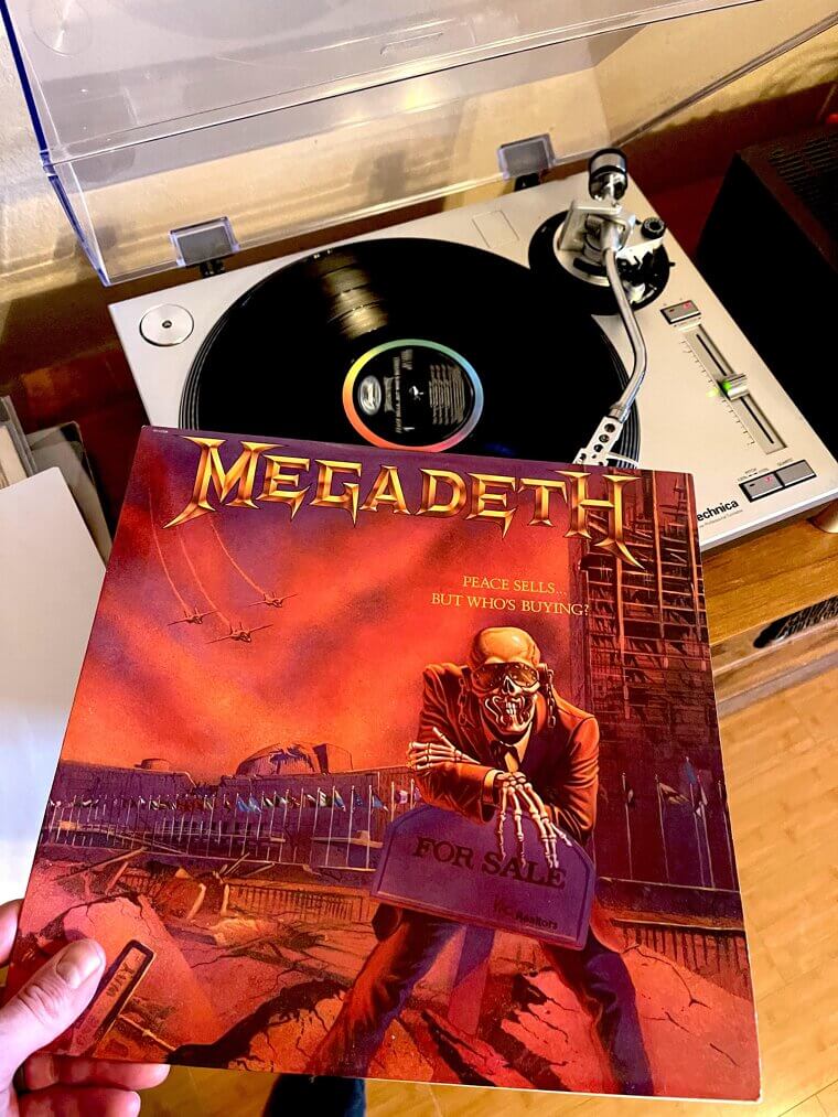
The imagery established Vic Rattlehead as 1 of the most recognizable mascots in heavy metal history. The biting social commentary of the cover helped elevate the group from standard thrash metal pioneers to serious political commentators within the aggressive music scene.
Dio, Holy Diver (1983), The Singer Purposely Requested the Provocative Imagery of a Monster Drowning a Priest to Angrily Challenge Conservative Watchdogs
The dramatic illustration portrays a massive demonic creature violently throwing a chained Catholic priest into a raging ocean. The singer, Ronnie James Dio, specifically requested the provocative imagery to challenge people's preconceived notions about good and evil. He frequently argued that the creature could actually be the hero, punishing a corrupt religious figure, forcing the viewer not to judge a book by its cover. The artwork infuriated conservative watchdogs and religious groups who demanded the record be pulled from shelves immediately.
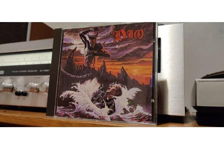
The controversy only fueled massive sales, turning the solo debut into a foundational pillar of heavy metal history. The stunning visual perfectly encapsulated the epic, fantasy-driven lyrical themes that the singer had built his legendary reputation upon during his previous stints in other massive bands.
Led Zeppelin, Led Zeppelin IV (1971), Robert Plant Found and Bought the Oil Painting Himself While Strolling Through the Streets of Berkshire
The painting of the rustic man carrying a bundle of wooden sticks on his back was reportedly purchased from an antique shop in Reading, Berkshire by Robert Plant. Plant and Jimmy Page were looking for imagery that contrasted modern city life with traditional rural nature. The painting was then hung on the peeling wallpaper of a partially demolished suburban house for the photoshoot. Fans speculated for decades about the identity of the old man, but researchers recently discovered it is allegedly a photograph of a 19th-century thatcher named Lot Long.
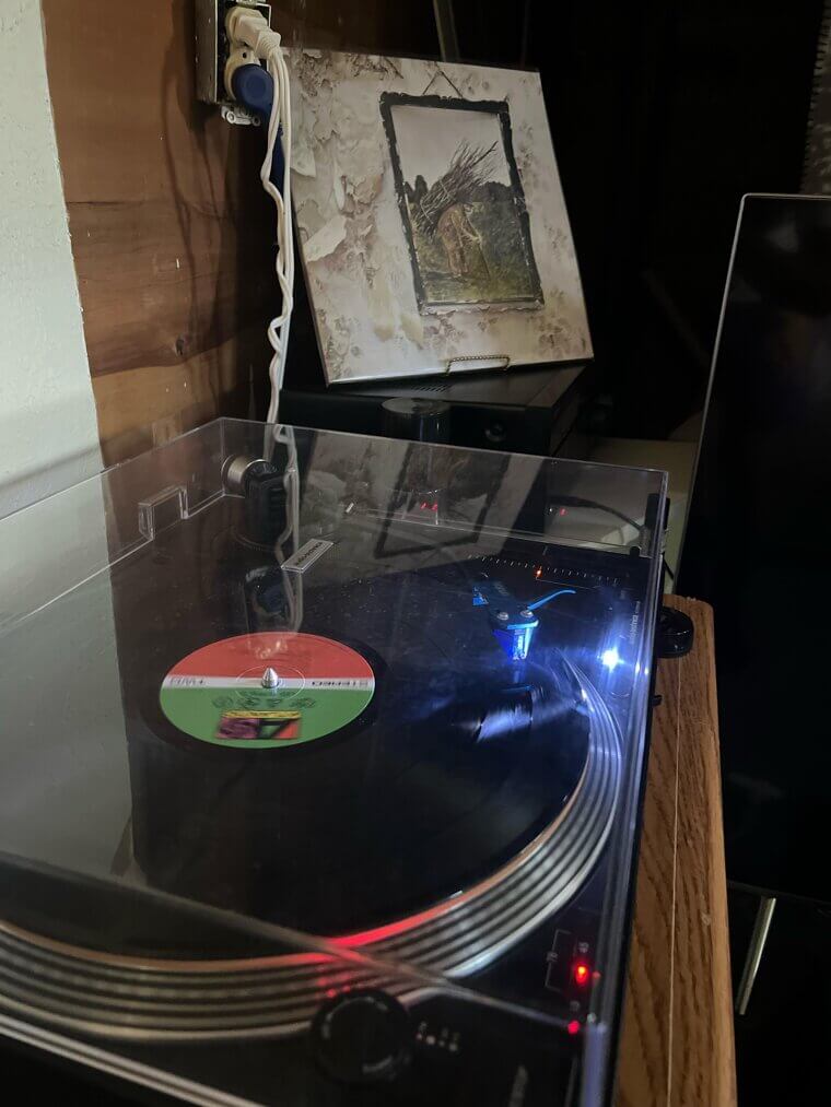
The band wanted the music to speak for itself, choosing not to print their name or the album title on the outside cover. The decision frustrated their record label, but the gamble paid off when the record became a monumental commercial success. The inner sleeve also contained unique occult symbols chosen by each of the 4 band members.
Metallica, Master of Puppets (1986), A Tiny Army Helmet and Dog Tags Were Hidden on One Cross to Secretly Echo Their Anti-War Lyrical Message
The striking illustration was painted by artist Don Brautigam over a period of just 3 days, based on a conceptual sketch provided by singer James Hetfield. It depicts a seemingly endless military cemetery with white crosses tied to strings held by a pair of unseen, shadowy hands in the blood-red sky. Upon closer inspection, 1 of the crosses on the left side of the field has an army helmet resting on top with dog tags dangling off the marker.
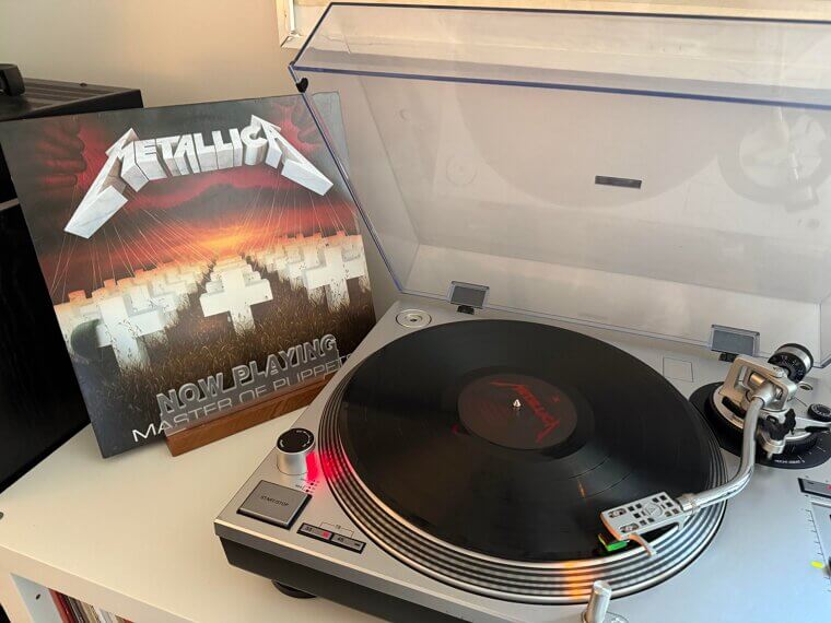
This specific detail connects directly to the anti-war themes explored in the track 'Disposable Heroes. ' The original painting was sold at auction in 2008 for a staggering 35000 dollars. The imagery perfectly captures the overarching lyrical theme of manipulation, whether by political leaders, addiction, or organized religion, solidifying the record as a defining statement of the thrash metal genre.
Korn, Korn (1994), The Elongated Shadow Belongs to the Art Director Looming Over a Label Executive's Completely Unsuspecting Young Niece
The unsettling cover shows a young girl in a school uniform sitting on a swing set, looking up at a tall, shadowy figure whose elongated shadow falls across her. The photograph was taken by Stephen Stickler, who intentionally angled the shot to obscure the man's face and create a sense of impending dread. The shadow actually belonged to the band's art director, who held up his hands to create the menacing silhouette.
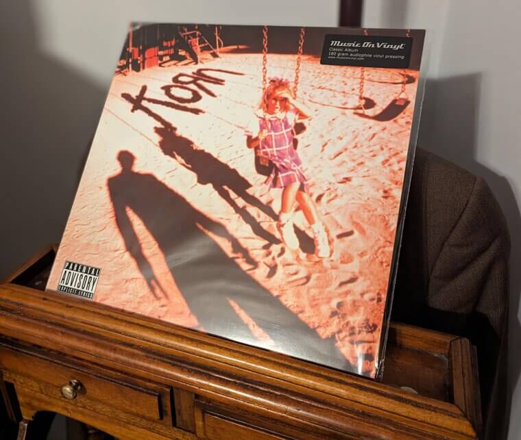
The little girl was the niece of 1 of the record label executives, unaware of the dark context of the photoshoot. The terrifying visual perfectly encapsulated the agonizing, personal lyrical themes of childhood trauma explored by the singer. The groundbreaking aesthetic helped launch the entire nu-metal movement that dominated the late 1990s.
AC/DC, Highway to Hell (1979), The Label Secretly Airbrushed a Pointed Demon Tail Onto Angus Young to Bypass Strict Mainstream Censorship Concerns
The group photograph presents the 5 band members standing together, with guitarist Angus Young wearing schoolboy attire complete with devil horns and a mischievous grin. The original artwork intended for the Australian release featured a much more elaborate design with flames and a highway graphic, but the international label opted for this simpler, starker portrait. In the final edit, a pointed demon tail was airbrushed onto Angus Young's figure to emphasize the menacing theme of the title track.
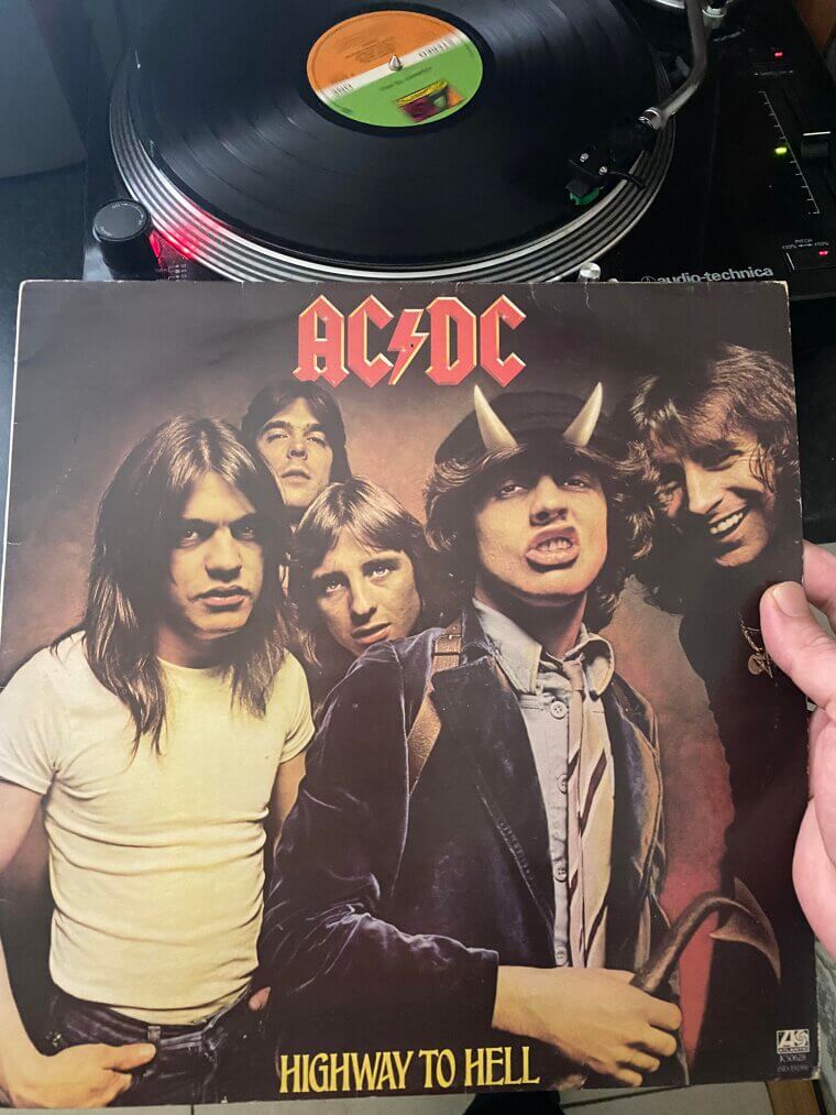
The visual sparked immediate controversy among religious groups who accused the group of promoting satanism, a claim the band members found highly amusing. The album marked the final vocal performance of Bon Scott, who tragically passed away months later. The minimalist design remains a defining symbol of straight-ahead, unpretentious heavy rock and roll, focusing on the rebellious attitude of the musicians.
Van Halen, 1984 (1984), The Cherubic Toddler Model Had to Be Bribed With Candy Cigs to Hold the Controversial Pose for the Camera
The memorable cover art depicts a cherubic baby with angel wings casually holding a cigarette in its hand. Artist Margo Nahas originally created the painting based on a photograph of her best friend's toddler, Carter Helm. Nahas brought a bowl of candy cigarettes to the photoshoot to get the child to pose properly. When the band saw her portfolio, they immediately chose the image because it matched their rebellious yet playful attitude.
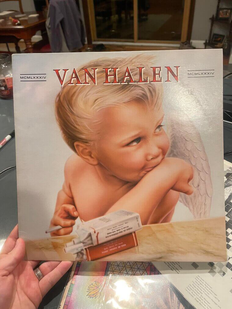
The artwork caused an uproar upon release in the United Kingdom, where authorities forced the label to place a sticker over the cigarette to censor it. The striking contrast between innocence and vice perfectly captured the essence of the Hollywood party rock scene. The boy in the painting grew up unaware of his fame until his mother finally revealed the truth to him in his teenage years.
Scorpions, Lovedrive (1979), The Surrealistic Imagery of Sticky Bubblegum Stretched Across Evening Wear Prompted an Immediate Retail Ban in America
The bizarre photograph depicts a sharply dressed man and woman sitting in the back of a luxury vehicle, with a massive piece of pink bubblegum stretching from the woman's exposed chest to the man's hand. Legendary designer Storm Thorgerson created the surreal visual to represent the sticky, complicated nature of romantic relationships. The imagery was considered highly provocative and was outright banned by major retailers in the United States upon release.
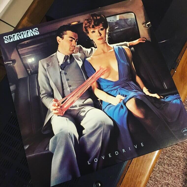
The band was forced to create an alternative, tamer cover featuring a simple blue scorpion for the American market. The original artwork eventually became a cult classic among fans for its strange, dark humor. The group always maintained that they simply wanted an eye-catching, memorable visual that stood out from the standard, boring group portraits of the era.
Rush, Moving Pictures (1981), The Complex Visual Masterpiece Hides a Triple Meaning About Literally Carrying Art While Eliciting Deep Emotional Responses
The design team at Hipgnosis created a brilliant visual pun that plays out across the front and back of the jacket. The front shows workers carrying classical paintings out of the Ontario Legislative Building in Toronto, literally moving pictures. People on the side are weeping, representing the emotional aspect of moving pictures as in films. The back reveals that the entire scene is actually being filmed by a movie crew, adding a 3rd layer to the pun.
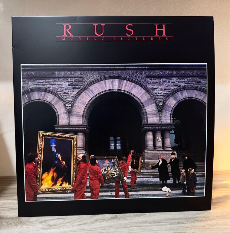
The paintings being carried include the Joan of Arc logo from an earlier record and the famous Dogs Playing Poker artwork. The intricate conceptual photograph required a massive crew and careful coordination to capture the layered meanings. Fans have spent countless hours dissecting the various elements hidden within the frame, cementing it as a masterclass in clever visual storytelling for a progressive rock masterpiece.
Guns N' Roses, Appetite for Destruction (1987), A Massive Retail Boycott Forced the Label to Quickly Swap the Original Artwork With a Tattoo Inspired Cross
The original jacket featured a controversial painting by artist Robert Williams that depicted a horrific scene involving a robotic entity. The artwork caused massive pushback from major retailers who refused to stock the record on their shelves. To save the release, the label quickly moved the painting to the inside sleeve and replaced the front with a new design. The new cover showcased a Celtic cross designed by Billy White Jr, featuring 5 skulls that represented each of the band members.
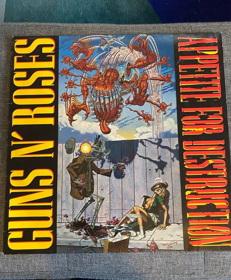
Axl Rose's skull is at the center, surrounded by Izzy Stradlin, Steven Adler, Duff McKagan, and Slash. The skull designs were inspired by the band's distinctive hairstyles and accessories. This rapid pivot ironically resulted in 1 of the most recognizable and heavily merchandised band logos in music history, turning a potential disaster into a massive commercial triumph for the group.
Iron Maiden, The Number of the Beast (1982), An Accidental Printing Plant Error Gave the Sky a Dark Blue Tint That the Band Decided to Keep Forever
Artist Derek Riggs created the legendary artwork featuring the band's zombie mascot, Eddie, manipulating a large red demon on strings, who in turn is manipulating a smaller Eddie. The concept was initially meant for a different single but was deemed far too good by manager Rod Smallwood, who saved it for this landmark full-length release. The visual sparked massive protests in the United States, with religious organizations reportedly organizing public burnings of the record.
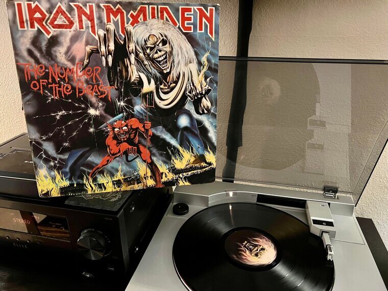
The band found the backlash ridiculous, pointing out that the image clearly shows their mascot holding power over evil rather than glorifying it. The dark sky in the background was originally supposed to be black, but a printing error at the manufacturing plant caused it to appear as a dark, murky blue. The band decided they liked the accidental blue tint and kept it for future pressings.
Def Leppard, Hysteria (1987), A Tiny Silhouette of a Person Is Hiding Inside the Mechanical Mouth as a Subtle Nod to Sensory Overload
The intricate digital illustration features a screaming face composed of various mechanical parts, buildings, and abstract geometric shapes. The artwork was created by Andie Airfix at Satori, who was given very little musical context since the band was still fine-tuning the notoriously delayed tracks. The concept was meant to represent the feeling of sensory overload and mass panic, mirroring the chaotic production process the group endured following drummer Rick Allen's tragic car accident.
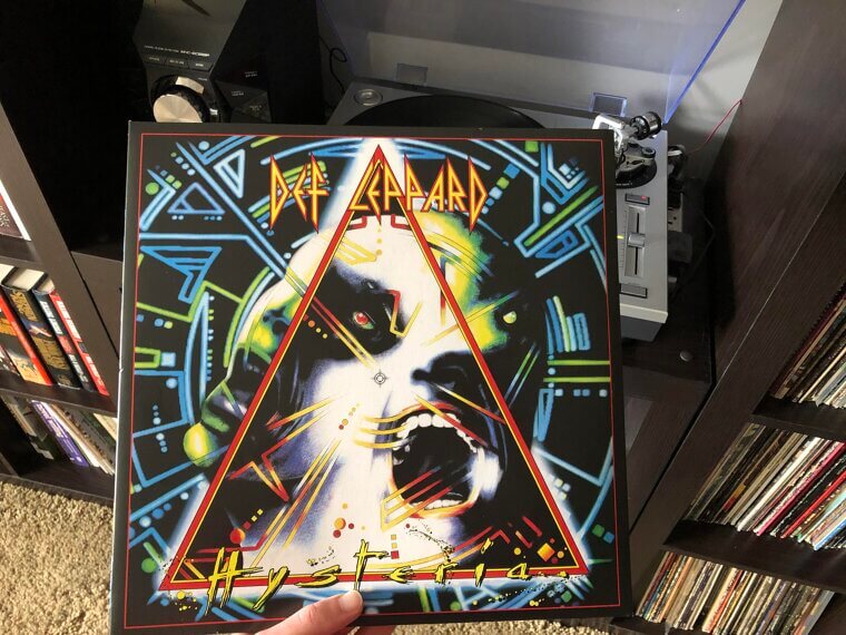
If you look closely at the center of the image, a small, subtle silhouette of a person standing in a doorway is visible inside the mechanical mouth. The bright yellow, red, and blue color palette was chosen specifically to stand out on crowded record store racks. The complex visual perfectly matched the polished, multi-layered production techniques used by producer Robert John 'Mutt' Lange to craft the massive arena rock sound.
Alice in Chains, Dirt (1992), The Crew Spent Hours Burying a Model Up to Her Chest in Artificial Clay Inside a Hollywood Studio Setup
The unsettling image features a woman buried up to her chest in a barren, cracked desert landscape. The photographer, Rocky Schenck, built the entire set inside his Hollywood studio using loads of clay, dirt, and paint to simulate the harsh outdoor environment. The model, Mariah O'Brien, had to sit in a specially constructed wooden box underneath the dirt for several hours while the crew arranged the cracked earth around her body.
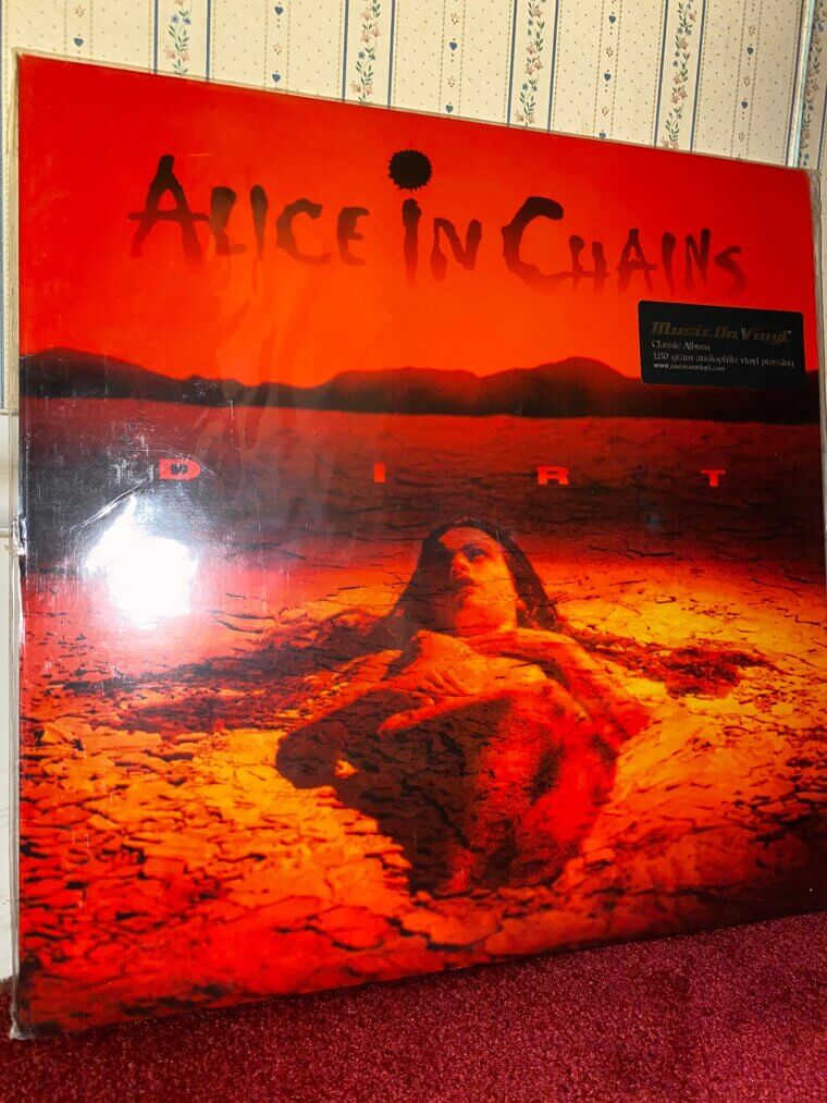
Fans speculated for years that the model was singer Layne Staley's girlfriend, but this was later proven false. The imagery was intended to reflect the personal and harrowing themes of addiction and depression found in the lyrics. The band was heavily involved in the art direction, ensuring the claustrophobic and desperate feeling translated perfectly to the visual aesthetic.
Queen, News of the World (1977), The Drummer Tracked Down a Vintage Science Fiction Magazine Artist to Custom Paint the Menacing Robot for Them
Drummer Roger Taylor discovered a 1953 issue of Astounding Science Fiction magazine that featured a giant robot holding a dead man. Taylor showed it to the rest of the band, who tracked down the original artist, Frank Kelly Freas, and asked him to recreate the painting for their new project. Freas happily agreed and replaced the single dead man with the 4 band members. Brian May and Freddie Mercury are shown grasped in the robot's metallic hand, while John Deacon and Roger Taylor are depicted falling to the ground below.
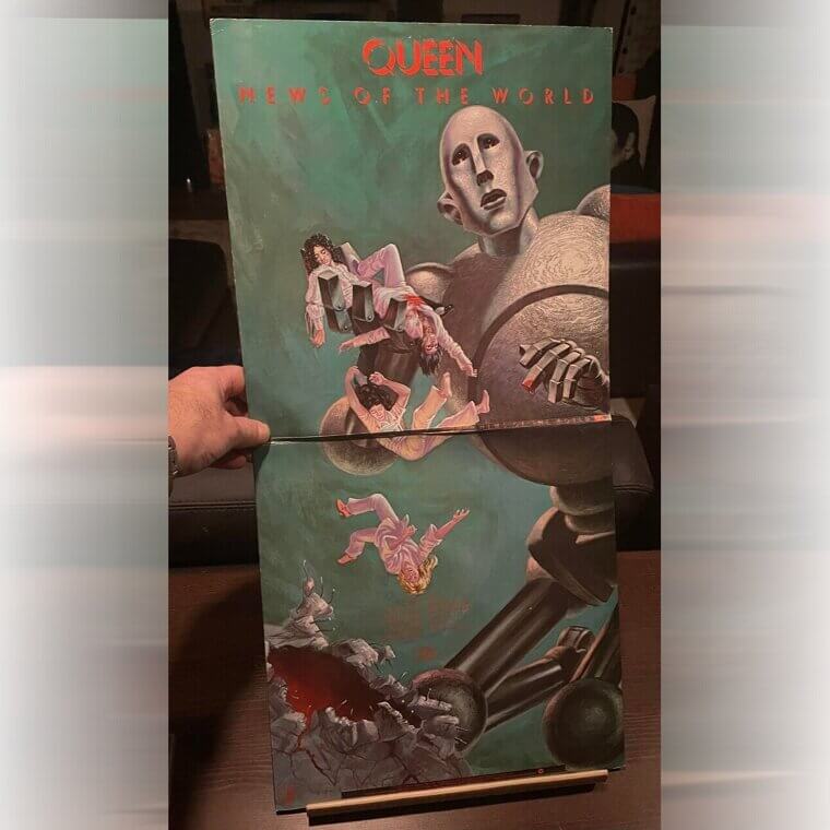
The striking sci-fi imagery was a massive departure from their previous opulent, classical aesthetics. The menacing robot, affectionately dubbed Frank by the fans, later served as the primary visual inspiration for a massive stage prop used during their 2017 world tour, cementing its legacy.
Aerosmith, Toys in the Attic (1975), The Sinister Gathering of Forgotten Attic Toys Was a Direct Visual Representation of Their Hectic and Chaotic Lifestyles
The cover portrays a dusty attic space where various neglected toys appear to have come to life. The concept was executed by illustrator Mark Hess, who meticulously painted the scene to give it a slightly sinister, nostalgic atmosphere. The title itself is an old colloquial expression referring to someone who has gone a bit crazy, which the band felt represented their chaotic lifestyle at the time. A closer look reveals several specific items scattered around the room, including a classic baseball glove and a vintage toy train set.
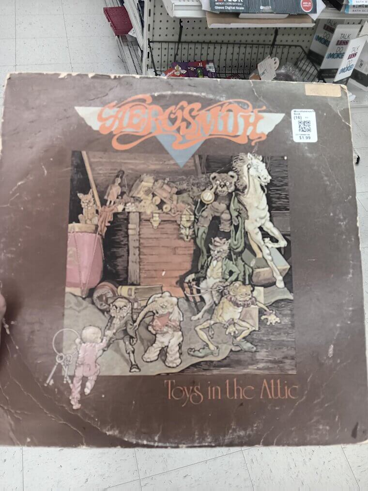
The band members wanted the art to reflect the raw, energetic, and slightly unhinged nature of the tracks they were recording. The haunting visual perfectly matched the gritty rock and roll sound that would eventually catapult them to massive mainstream success across the globe.
Kiss, Destroyer (1976), The First Painting Was Rejected by Executives for Being Too Violent Because It Depicted a City Actively Burning Down
The epic illustration shows the 4 members wearing heavy fantasy armor while leaping heroically over the smoking rubble of a ruined city. The band hired renowned fantasy artist Ken Kelly, famous for his Conan the Barbarian illustrations, to capture their larger-than-life stage personas. Kelly's 1st version of the painting was actually rejected by the record label for being too violent, as it featured a burning city in the background. Kelly was forced to paint a 2nd, slightly toned-down version with blue skies and less fire.
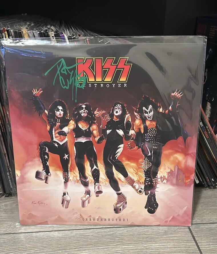
The band was supposedly thrilled with the final result, feeling it finally transformed them from a mere rock group into legitimate comic book superheroes. The artwork played a massive role in marketing their merchandise to younger audiences, solidifying their status as a global marketing juggernaut in the music industry.
Soundgarden, Superunknown (1994), The Terrifying Face Hovering in the Murky Forest Was Actually Created Using an Upside-Down Plastic Novelty Toy
The surreal and murky visual features a heavily distorted photograph of the band members hovering over an eerie, darkened forest floor. Photographer Kevin Westenberg used a special cross-processing technique to achieve the intense, saturated colors and blurred edges without any digital manipulation. The strange, screaming elf face visible in the center is actually a photograph of an upside-down plastic novelty toy that the band brought to the shoot. The visual was intended to evoke a feeling of disorientation and psychedelic unease, matching the heavy, alternative metal grooves of the music.
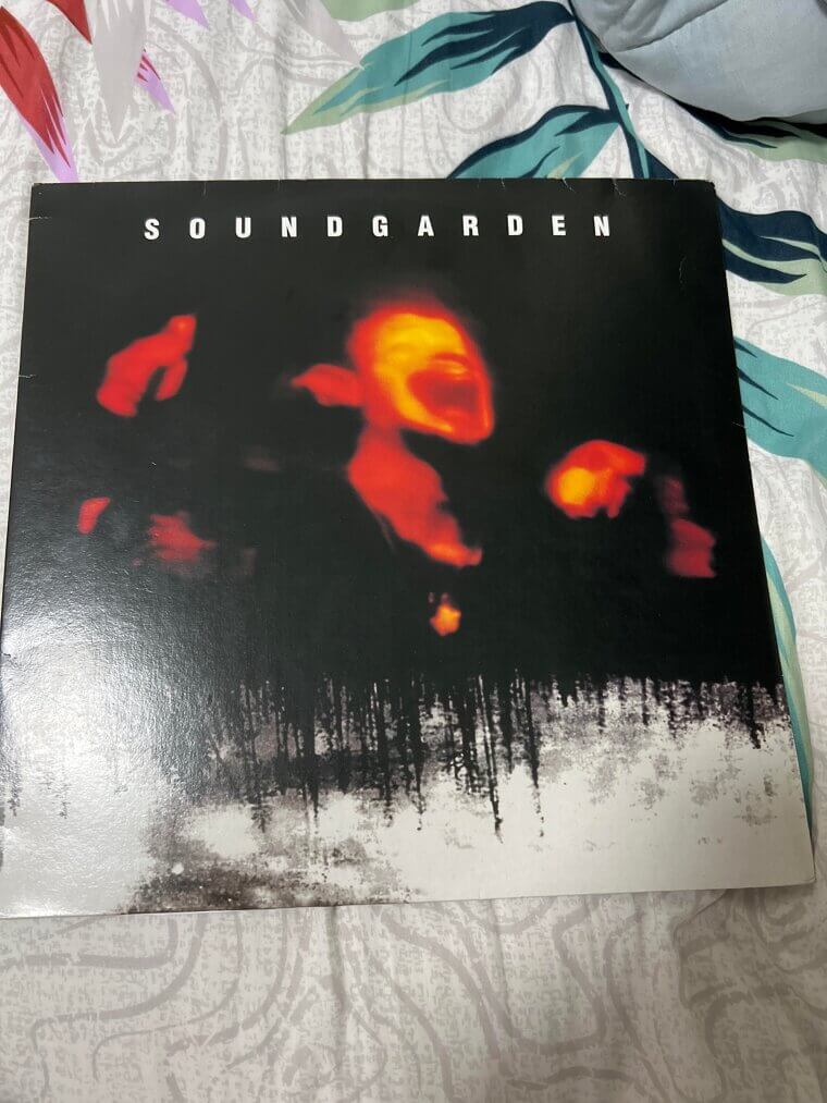
The label initially pushed for a more traditional band portrait, but singer Chris Cornell insisted on this abstract, mysterious approach. The enigmatic image remains a definitive visual representation of the booming 1990s grunge movement and its rejection of polished commercial standards.
Deep Purple, Deep Purple in Rock (1970), The Group Arrogantly Replaced the Faces of American Presidents on Mount Rushmore With Their Own Likenesses
The audacious cover art replaces the faces of the 4 American presidents on Mount Rushmore with the faces of the 5 band members. The concept was a direct statement of intent from the group, symbolizing their desire to cement themselves as monumental figures in the burgeoning heavy rock scene. The artwork was designed by the band's management team, who wanted to aggressively market their new, much heavier musical direction. Ian Gillan, Ritchie Blackmore, Jon Lord, Roger Glover, and Ian Paice are all instantly recognizable in the stone carvings.
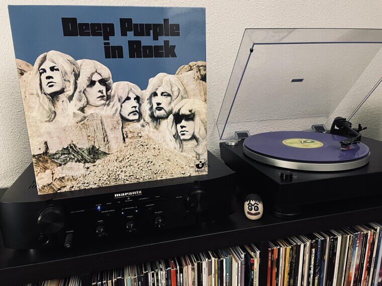
The arrogant but brilliant visual matched the sheer volume and power of the tracks, successfully distancing them from their earlier psychedelic pop sound. It set a massive precedent for the grandiose, confident aesthetics that would define arena rock for the rest of the decade.
Motley Crue, Shout at the Devil (1983), Executives Refused to Name the Project Shout With the Devil Fearing an Unprecedented Nationwide Retail Store Boycott
The original jacket featured a stark, black-on-black design showcasing a massive pentagram that was only visible when held at a certain angle to the light. The band intentionally chose the dark, sinister imagery to provoke a reaction from conservative groups and generate free publicity. Bassist Nikki Sixx allegedly wanted to name the record 'Shout with the Devil', but the label executives flatly refused, fearing massive boycotts from retailers. The compromise resulted in the iconic title, but the satanic imagery still caused a massive amount of controversy across the country.
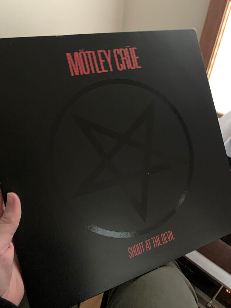
Inside the gatefold, the band members were photographed wearing heavy makeup and apocalyptic leather armor, heavily inspired by post-apocalyptic films. The visual shift fully established their reputation as the most dangerous and glamorous group operating on the sunset strip during the early 1980s.
Judas Priest, British Steel (1980), The Photographer Used an Oversized Prop Razor Blade to Imply Cutting Edge Aggression Without Showing a Single Drop of Blood
The minimalist yet striking cover displays a large industrial razor blade being gripped tightly by a hand, with the band's name etched directly into the metal. The photograph was taken by Bob Carlos Clarke, who wanted to visually represent the sharp, cutting-edge sound the group had developed. The band actually considered using a real razor blade for the shoot, but opted for an oversized, custom-made prop to ensure it looked massive and imposing.
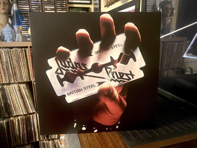
The bloodless image managed to imply danger and aggression without relying on typical gory shock tactics. The aesthetic heavily influenced the leather and studs fashion movement that dominated heavy metal throughout the decade. The album itself was recorded at Tittenhurst Park, the former home of John Lennon, adding an unexpected layer of rock history to the aggressive final product.
Pantera, Vulgar Display of Power (1992), A Professional Boxer Threw the Crushing Punch Mere Inches From the Model to Simulate the Brutal Point of Impact
The iconic image captures the exact moment a man's face is distorted by a brutal, crushing punch. For years, a rumor circulated that the band paid a random fan 10 dollars to let them punch him in the face repeatedly until they got the perfect shot. In reality, the photographer hired a professional model named Sean Cross and used a combination of clever lighting and a slow shutter speed to simulate the impact.
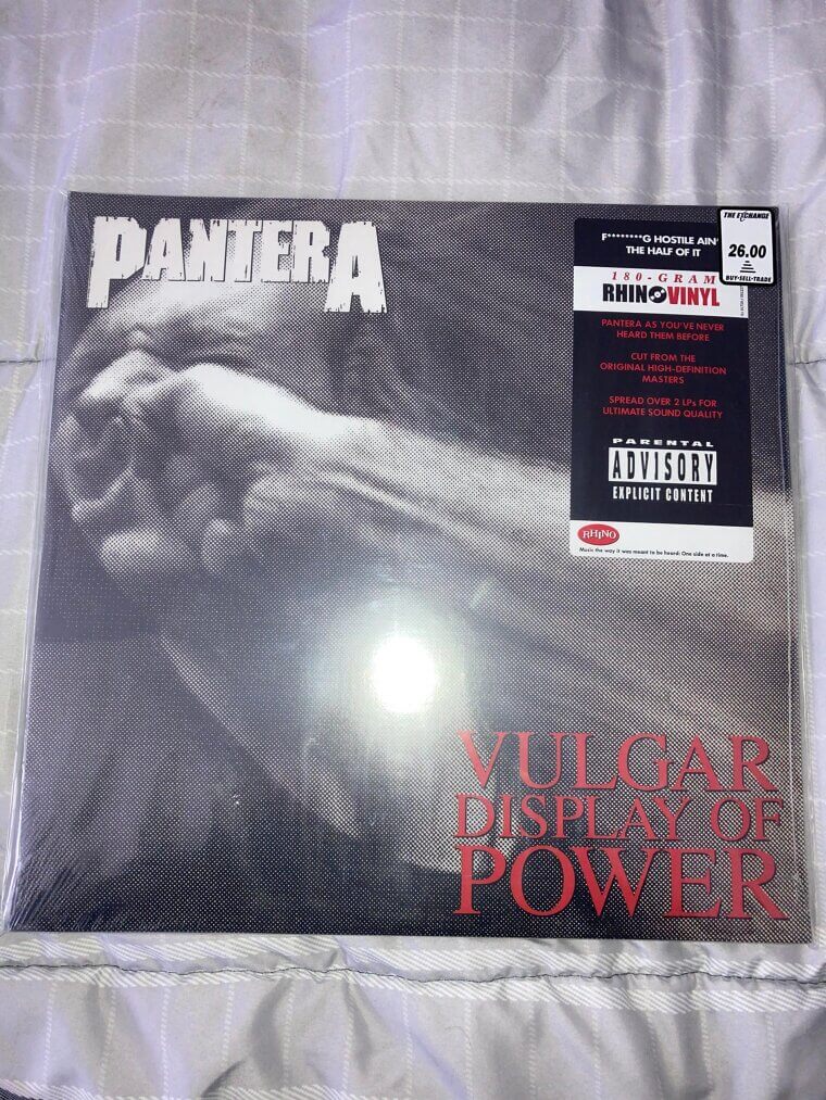
The fist actually belonged to a professional boxer who threw the punch mere inches from the model's skin. The visual is a literal interpretation of a line from the classic film The Exorcist, which singer Phil Anselmo suggested for the title. The raw, unfiltered aggression of the artwork perfectly matches the heavy, groove-oriented sound that redefined 1990s metal.
Pearl Jam, Ten (1991), The Bassist Hand-Built the Massive Maroon Wooden Letters in His Garage to Maintain Total Creative Control Over the Shoot
The passionate group photo shows the 5 band members reaching up together in front of a giant, maroon-colored word 'Pearl Jam'. The massive wooden letters in the background were actually hand-built by bassist Jeff Ament, who worked as a graphic designer before the band exploded in popularity. Ament constructed the set piece in his garage and brought it to the photoshoot to ensure the band had creative control over their image.
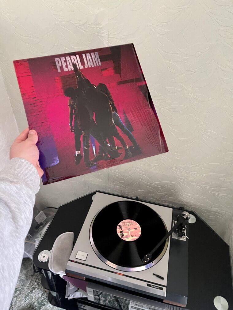
The band chose to physically stand united in the shot to visually represent their brotherhood and collaborative songwriting process. The intense, serious aesthetic was a stark contrast to the glamorous fashion of the previous decade. The album was originally titled 'Superstar' but was changed to honor the jersey number of professional basketball player Mookie Blaylock, whom the band admired.
Motorhead, Motorhead (1977), The Ferocious Snaggletooth Mascot Was Actually a Terrifying Hybrid of a Wild Boar, a Gorilla, and a Dog Skull
The ferocious cover introduced the world to the band's iconic mascot, the War-Pig, also affectionately known as Snaggletooth. Artist Joe Petagno created the terrifying hybrid of a boar, gorilla, and dog skull, adorned with heavy iron chains, spikes, and an oversized helmet. Petagno was inspired by the aggressive, outlaw biker culture that the singer admired. The stark black and white contrast made it a highly popular design for leather jackets and tattoos among hardcore fans.
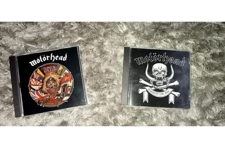
The symbol perfectly captured the loud, fast, and uncompromising attitude of the trio, blurring the lines between punk rock and heavy metal. The mascot became so popular that it appeared on virtually every single album cover the band released over their entire 40-year career, cementing its status as 1 of rock's most legendary logos.
Nine Inch Nails, The Downward Spiral (1994), The Artist Constructed the Physical Canvas Using a Disturbing Mixture of Dried Blood, Dead Insects, and Rusted Metal
The textured, abstract artwork was created by artist Russell Mills, who constructed a physical canvas using a disturbing mixture of materials. Mills reportedly incorporated dried blood, dead insects, salt, dirt, and rusted metal onto a wooden board to achieve the decaying, industrial look. The piece, titled 'Wound', was designed to visually represent the intense themes of physical and mental deterioration explored in the music. The band's frontman, Trent Reznor, gave Mills free reign after discussing the personal concepts behind the lyrics.
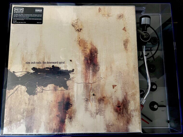
The abrasive textures perfectly complement the harsh synthesizers and distorted guitars that dominate the groundbreaking record. The original physical artwork is still preserved today, serving as a dark, tactile artifact from 1 of the most acclaimed alternative albums of the modern rock era.
Foo Fighters, The Colour and the Shape (1997), The Futuristic Atomic Shapes Were Actually Painted Bowling Pins and Plumbing Equipment Photographed on a Physical Studio Set
The strange, otherworldly cover looks like a digital rendering of a futuristic atomic structure, but it was actually a physical set built in a photography studio. Art director Andy Engel constructed the bizarre, rounded shapes using painted bowling pins, Christmas ornaments, and various pieces of plumbing equipment. The title of the record was reportedly a phrase used by the band's manager when he was trying to buy furniture and couldn't decide between different styles.
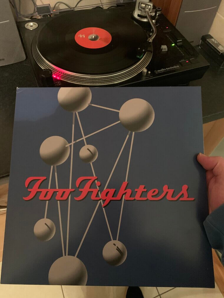
The band wanted the artwork to feel detached from the typical grunge aesthetic they were previously associated with. The bright, clean lines and stark shadows created a unique visual identity that helped establish them as an independent creative force. The visual remains a favorite among fans for its clever use of practical effects over early computer graphics.
Tool, Ænima (1996), The Highly Elaborate Lenticular Packaging Was So Expensive to Produce It Caused Major Headaches for Label Accountants
The innovative physical packaging utilized a ribbed, lenticular plastic jewel case that created an optical illusion when tilted by the viewer. The multi-image insert featured several bizarre, esoteric visuals, including a contortionist, an eye covered in strange symbols, and a painting of the band members dissolving. Guitarist Adam Jones, who had a background in Hollywood special effects, heavily directed the intricate art design. The complex packaging was highly expensive to manufacture, causing major headaches for the record label's accounting department.
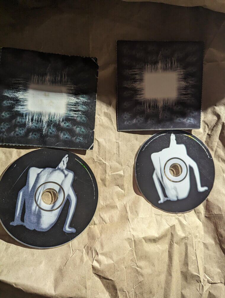
The band insisted on the elaborate design to reward fans who actually purchased physical media rather than just copying tapes. The hidden visual elements perfectly matched the complex, progressive rhythms and philosophical lyrical themes that the group had painstakingly developed for this landmark release.
System of a Down, Toxicity (2001), The Altered Hollywood Sign Artwork Dropped Exactly 1 Week Before 9/11 and Instantly Sparked Massive Censorship Discussions
The stark, provocative cover features a photograph of the famous Hollywood Hills, but the legendary sign has been altered to display the band's name instead. The visual was an aggressive, satirical attack on the entertainment industry and the artificial nature of Los Angeles celebrity culture. The band members, all of Armenian descent, frequently used their music to criticize political corruption and social decay. The simple yet highly effective digital manipulation was designed by Mark Wakefield, who wanted to create a striking image that felt both familiar and unsettling.

The imagery sparked massive discussions about censorship and corporate greed immediately upon its release. The album dropped exactly 1 week before the tragic events of September 11, and the politically charged artwork took on even heavier significance in the months that followed.
Slayer, Reign in Blood (1986), Label Executives Were Allegedly So Horrified by the Grotesque Political Collage That They Initially Refused to Release the Record
The nightmarish artwork features a highly controversial collage created by artist Larry Carroll, combining elements of political corruption, religious hypocrisy, and brutal violence. Carroll utilized a mixed-media approach, blending oil paints, pencil sketches, and actual photographs cut out from magazines to create the chaotic hellscape. The label executives at Def Jam were allegedly so horrified by the final product that they initially refused to release it. The band had to secure a new distribution deal just to get the music into stores.
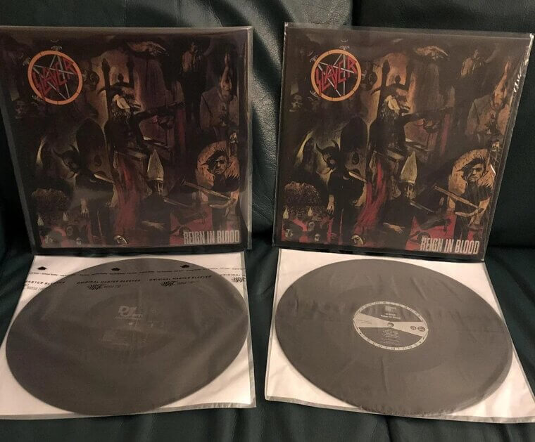
The grotesque visual perfectly matches the extreme speed and aggression of the defining thrash metal masterpiece. The artwork remains a fiercely debated piece of music history, solidifying the group's reputation as the most uncompromising and dangerous act of their entire generation.
Slipknot, Slipknot (1999), The Band Refused a Proper Set and Insisted on Standing Inside the Grimy Rusted Boiler Room of Their Malibu Recording Studio
The intense photograph captures the 9 anonymous band members wearing matching red jumpsuits and their signature grotesque masks, standing inside a dingy, rusted boiler room. The band insisted on taking the photo in the actual basement of their recording studio in Malibu, California, to capture an authentic atmosphere of claustrophobia and grime. The masks were originally conceptualized by percussionist Shawn Crahan, who wore a clown mask to rehearsals to unsettle his bandmates.
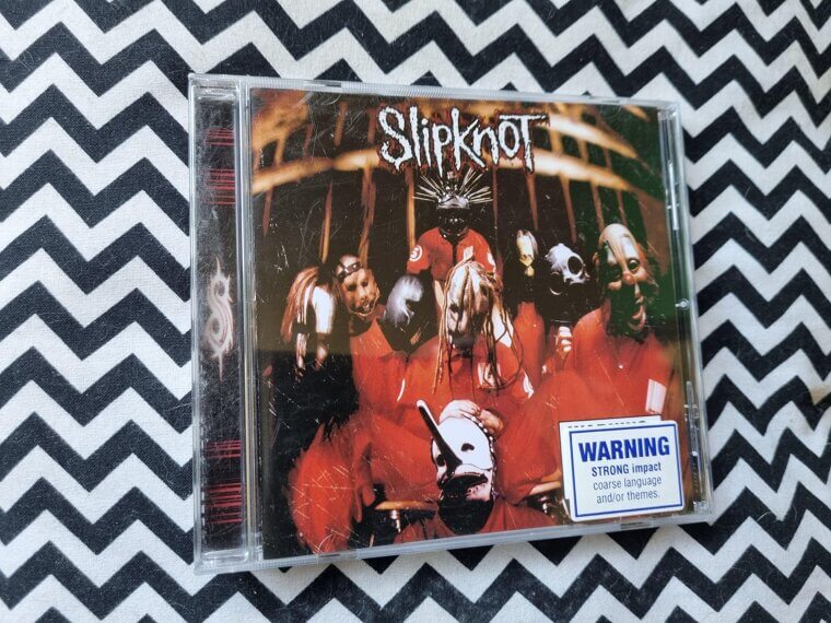
The visual anonymity forced the audience to focus on the chaotic, aggressive music rather than the individual musicians' personalities. The menacing aesthetic made them instant icons in the heavy music world, terrified parents everywhere, and built a loyal fan base. The raw, unfiltered energy of the image remains unmatched in modern metal history.
Ghost, Opus Eponymous (2010), The Skeletal Figure Standing Beneath the Massive Moon Was a Direct Loving Tribute to a Famous 1979 Television Horror Poster
The haunting cover features an illustration of a skeletal, anti-pope figure standing beneath a massive, glowing moon and hovering bats. The artwork is a direct, loving homage to the iconic promotional poster for the 1979 horror television miniseries Salem's Lot. The mysterious Swedish band deliberately leaned into classic horror movie aesthetics to build their theatrical, retro-sounding brand of rock. The artist intentionally used a muted blue and yellow color palette to give the image an authentic, vintage 1970s feel.
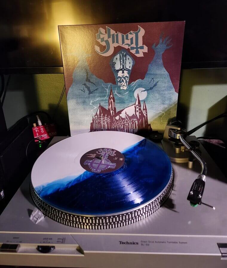
The visual perfectly complemented the band's strict anonymity and their satirical, satanic lyrical themes. The brilliant fusion of classic rock sounds and vintage horror imagery catapulted the secretive group from the underground scene into massive mainstream arena headliners over the next decade.